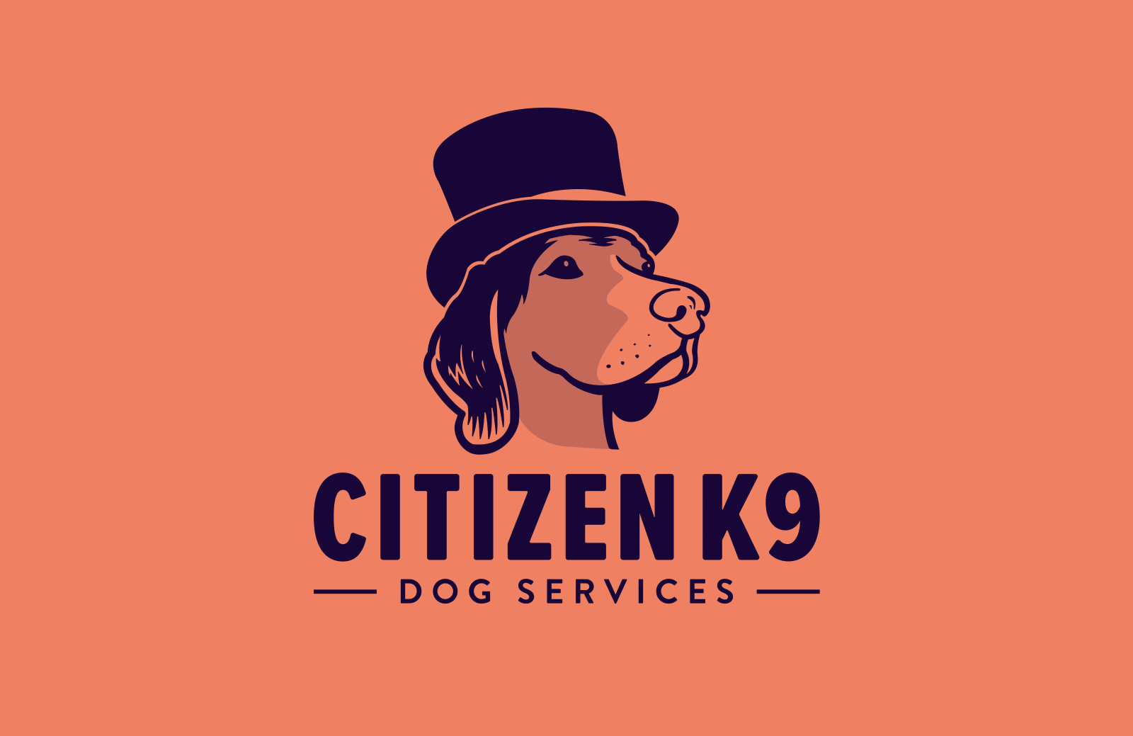
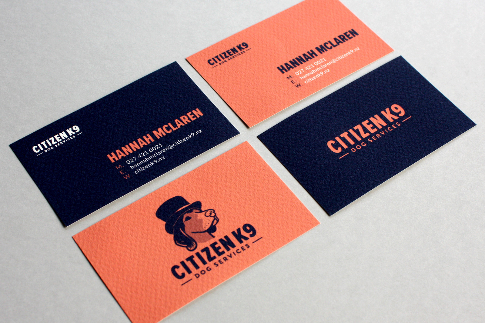
Citizen K9
––––––––
M Y C O N T R I B U T I O N
Full creative direction and design.
A G E N C Y
Personal Freelance.
––––––––
Hannah came to me needing a logo for her new business – Citizen K9 – specialising in dog walking, care and home stays in the Auckland area. In a crowded market, it was recognised a unique and interesting logo would be needed to stand out.
The one prerequisite in the brief was for the design to feature Hannah’s dog Baloo in some way. It was important to strike a balance between something friendly and fun, while also being reliable, honest and caring.
The name Citizen K9 leant itself to humanising Baloo, so I illustrated him in the style of a stately portrait. The addition of the top hat reinforces this air of importance, and also helps give him an element of cheekiness and fun.
The colours represent two important sides of Hannah’s business – the bright peachy orange is for the energetic, happy, fun loving nature of dogs at play, and the deep blue represents trustworthiness and reliability.
Ethos
––––––––
M Y C O N T R I B U T I O N
Full creative direction and design.
A G E N C Y
Personal Freelance.
––––––––
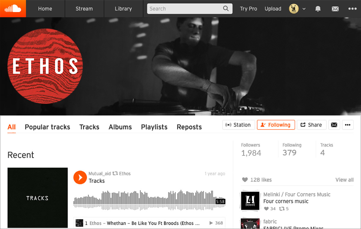
Ethos is a music producer and dj based in Sydney, Australia – focusing on Drum & Bass production. Following the recent signing of one of his tunes to a record label, he was in need of a simple logo to help build a following across social media and within the tight industry.
The word Ethos is defined as the fundamental character of a culture, which underlies their beliefs, customs and practices. A term that applies well to Drum & Bass, as it’s considered one of the most technical styles of dance music to make – requiring very precise intricate drum patterns layered with synthesised bass and sampled elements. In short, to make it well requires a lot of time, musical ability, and a perfectionist’s attention to detail.
With this in mind, I took inspiration for the logo from Japanese artisan knives – or Wa-Bõchõ. Hand-crafted with techniques that have been passed down over centuries, these knives are regarded around the world for their excellence in performance, precision, and aesthetic beauty. Commonly incorporating Damascus steel – a process where layers of steel are built up to create a stronger product – it also gives the Wa-Bõchõ a unique patterning, where no two are ever alike. An ethos that marries precision, technique and art.
The basic wordmark takes form with a simple, clean, modern san-serif font, with angular tweaks to represent the Wa-Bõchõ blade. When utilised on social media it is combined with a texture of Damascus steel, to give further reference to the knives, and provide visual interest.
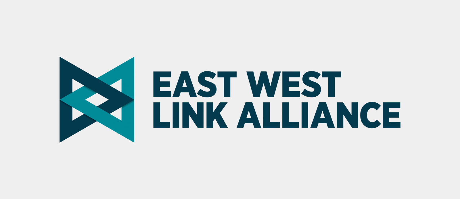
East West Link Alliance
––––––––
M Y C O N T R I B U T I O N
Full creative direction and design.
A G E N C Y
PORT, Auckland.
––––––––
The East West Link Alliance is a group consisting of the NZTA and a number of construction companies, tasked with planning and building the East West Link – a top priority transport project in Auckland, aiming to improve the network between State Highways 1 and 20 in the Onehunga-Penrose area.
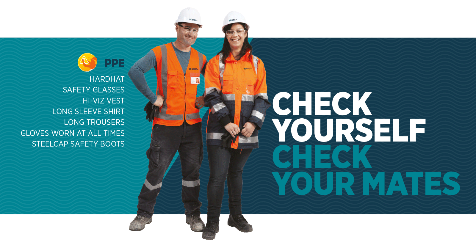
EWLA needed a basic identity developed to represent their unique alliance and the project, to be used on internal communications.
Inspiration for the identity was taken from the geographic centre of the project – the Mangere Inlet. The Inlet was an important area for early Maori in the Auckland region. It is the location of the shortest overland route between the Manukau and Waitemata Harbours, making it of immense strategic and cultural importance. It had several portages to the Pacific Ocean and to the Waikato River, and various villages and pa were clustered around it. Snapper, flounder, mullet, scallops, cockles and pipi provided food in plentiful amounts.
Abstract forms were developed, symbolising the inlet – ocean, water, waves, shimmering light. These textures can then be applied to communications to provide visual interest.
The logo mark symbolises the coming together of the region – making travel across it quicker and easier. The triangle shapes evoke the idea of movement – passing traffic, people, freight and is also reminiscent of the arrows on a compass, pointing East and West. The interlocking shape symbolises the importance of team work within the alliance, a coming together of difference skills to form a stronger whole.
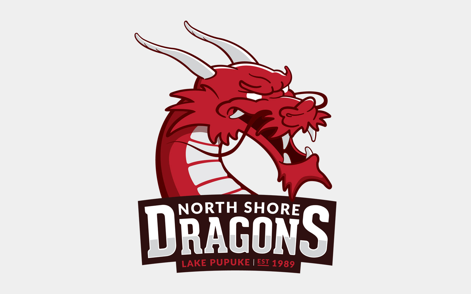
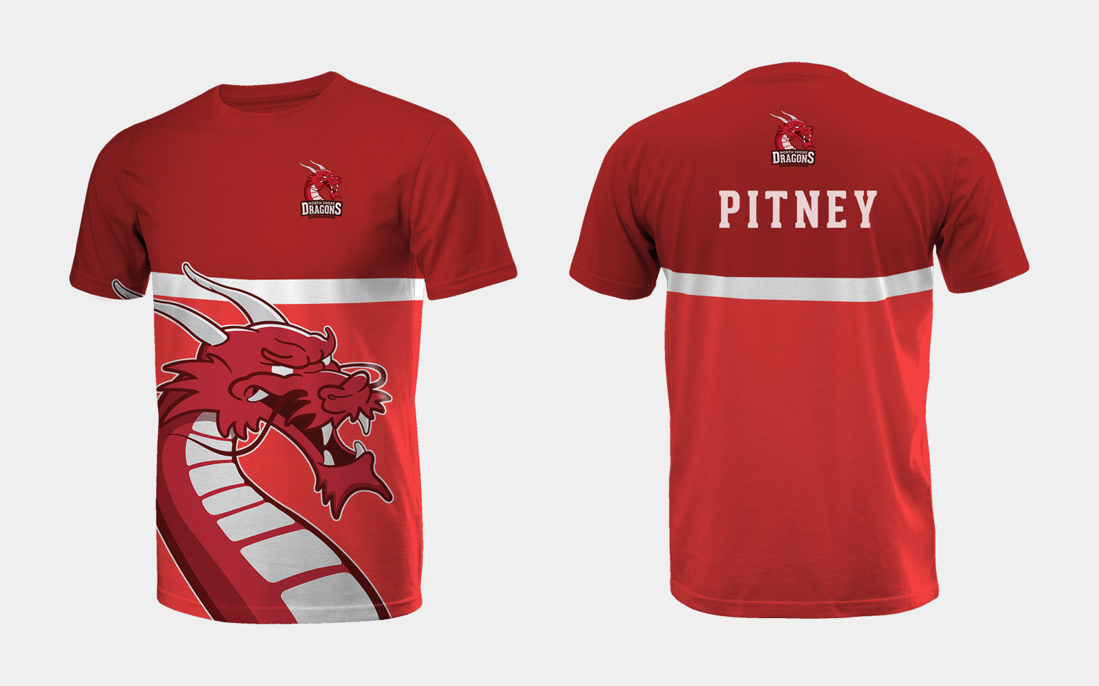
North Shore Dragons
––––––––
M Y C O N T R I B U T I O N
Full creative direction and design.
A G E N C Y
PORT, Auckland.
––––––––
The North Shore Dragons are a social dragon boating team based in Takapuna, Auckland. They were in need of a new logo, the previous one being dated and fairly plain. It was a pretty open brief, the only key requests were for something dynamic, and in the style of a professional sporting franchise.
The dragon form I decided to go with is based on the Japanese Ryu dragon. Considered a water deity, the Ryu lives in lakes or rivers, and are typically depicted as large, wingless serpentine creatures capable of granting wishes. It is powerful and fearless, key attributes to any dragon boating team.
Focusing on the head and neck for simplicity and detail reasons, the dragon is illustrated in a menacing pose, ready for action, and casting fear into its opponents. The angle of the head slightly covering the text banner, the open mouth, and “whiskers” moving in the wind provide a dynamic shape. The colours were chosen to link back to the maroon used in the old logo, and to be bright and eye catching.