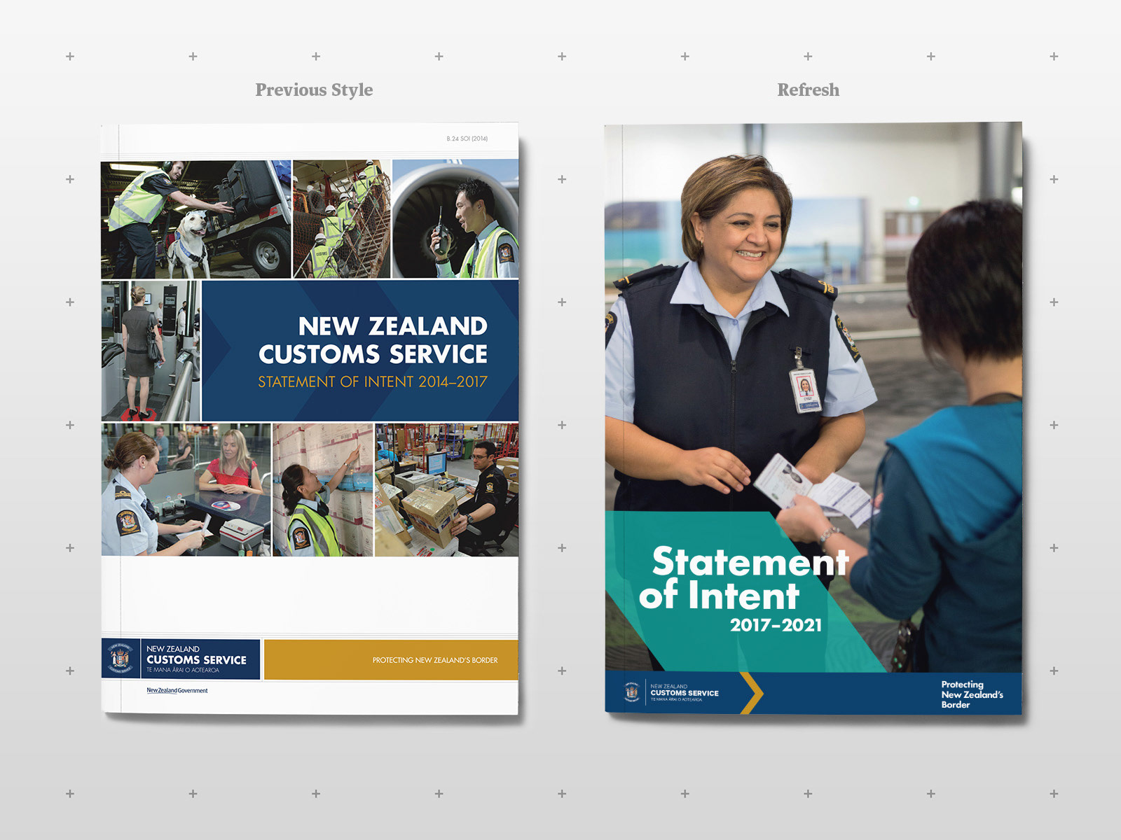
New Zealand Customs were in need of refreshing their old, out-dated visual identity. Being one of the oldest government agencies in the country, it was import they they retained links to their history, and remained mostly serious and authoritative in tone, while still achieving a modern look.
––––––––
M Y C O N T R I B U T I O N
Creative direction and design of visual identity and supporting communications.
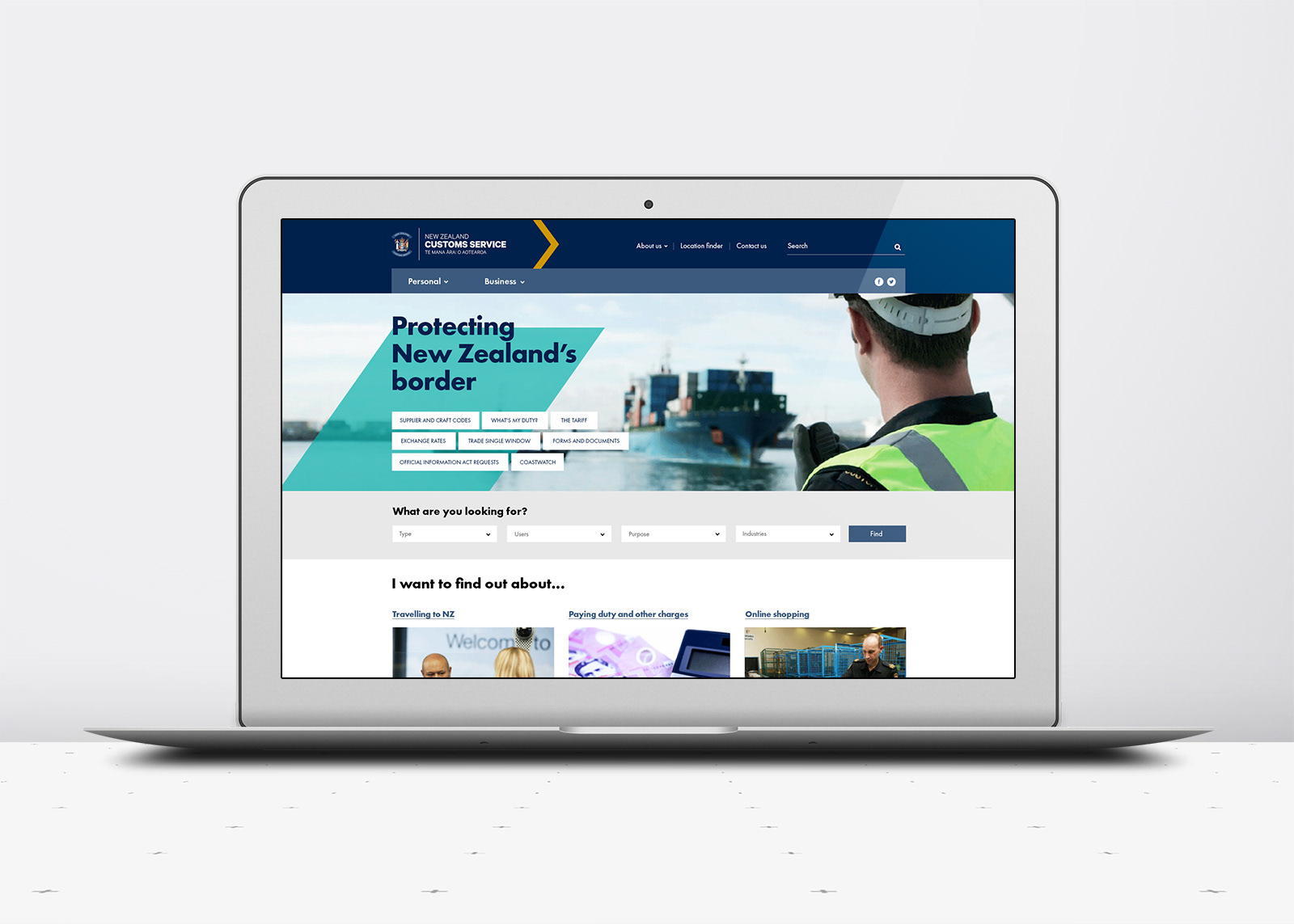
Note: website design & development was done externally, we advised on integrating the new identity into it.
A G E N C Y
PORT, Auckland.
––––––––
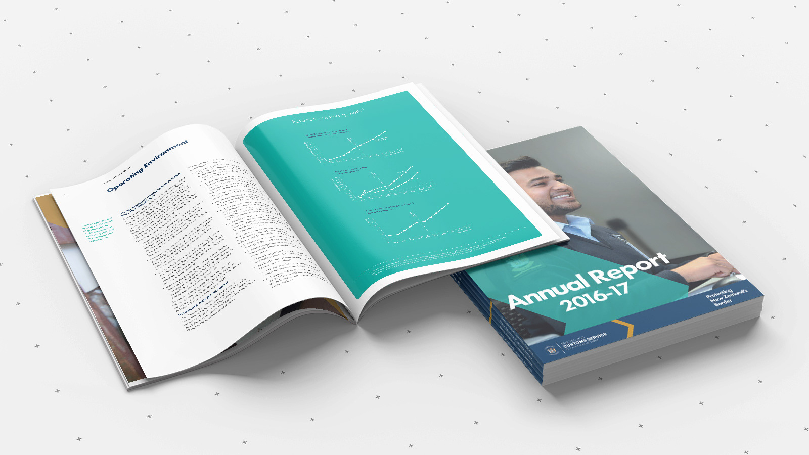
Their traditional blue and gold colours were retained as important references to their history, with the addition of teal to liven and freshen the look.
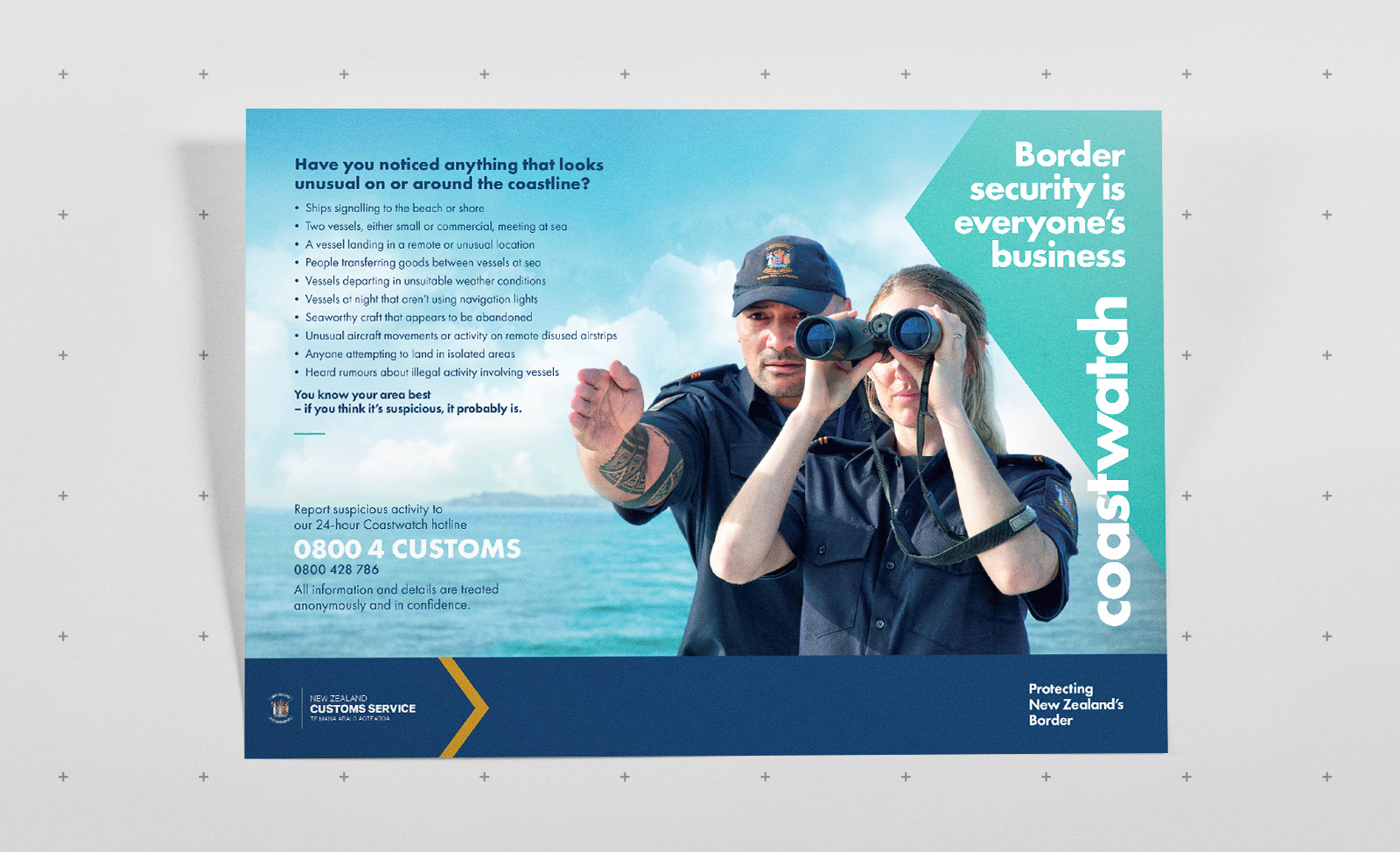
The chevron was also something they wanted to retain, however its use has been developed to make it more prominent. As well as forming part of a formal logo lockup, we have also made it into a more adaptable graphic device that can be applied, positioned and repeated within the branded communications, to help emphasis key messages or headings.
A full new photography shoot was also done, aiming to showcase the important and diverse roles that Customs staff carry out every day. Open and friendly interactions with the public and other staff members is key to help improve perceptions of Customs as a people-focused organisation. Strong, hero-shot style imagery is used to tell a single visual story instead of their previous style of montages.