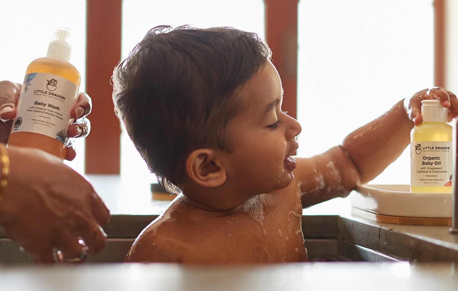
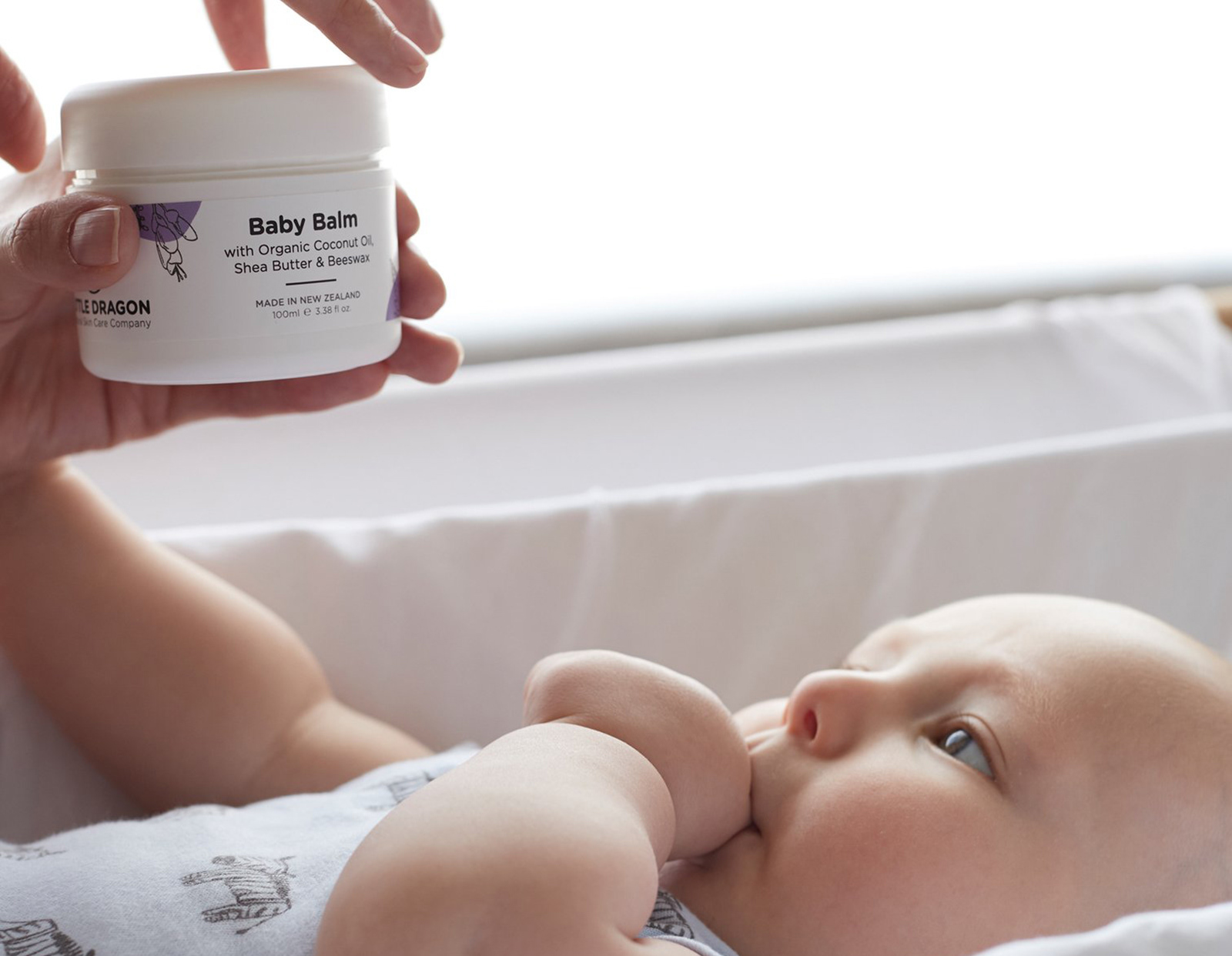
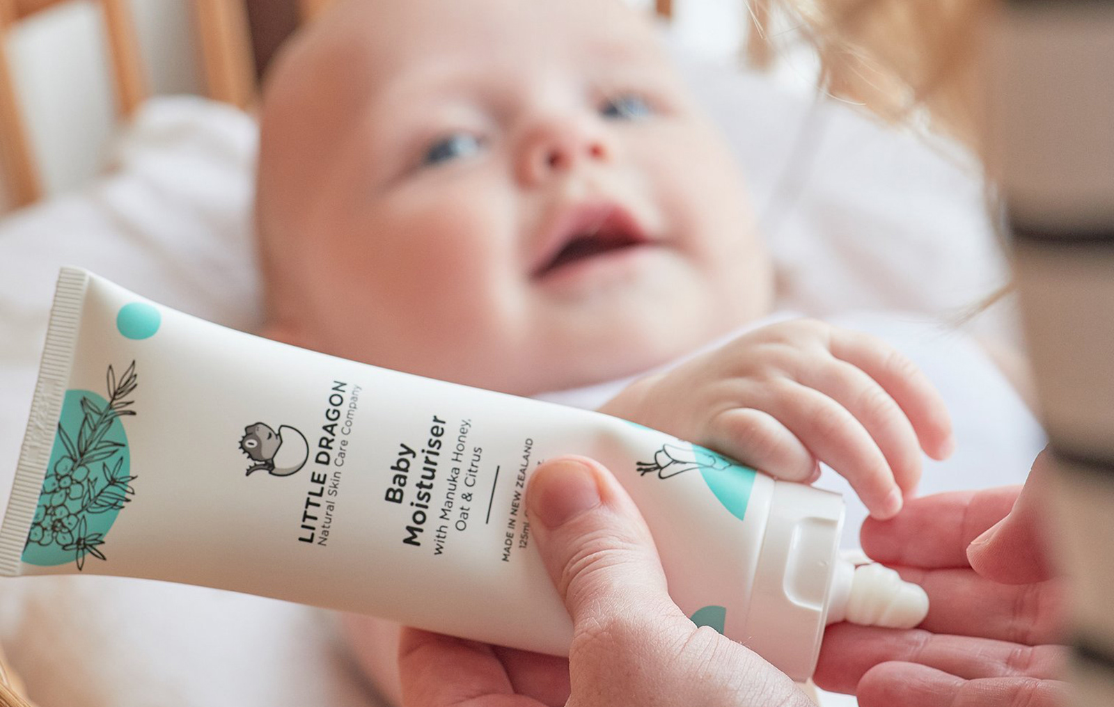
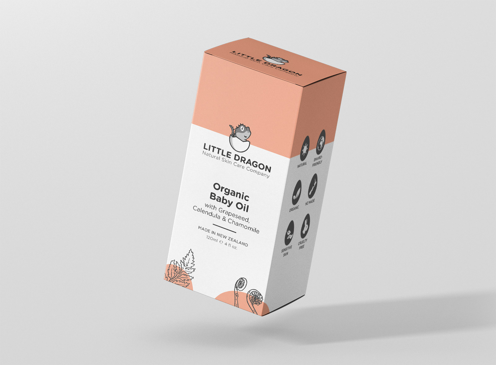
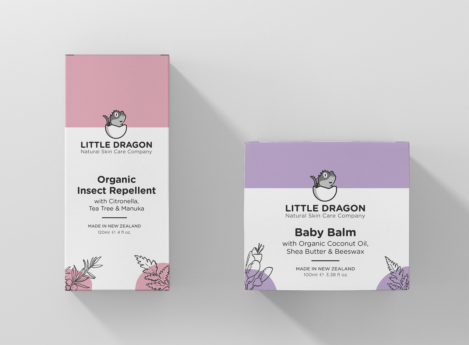
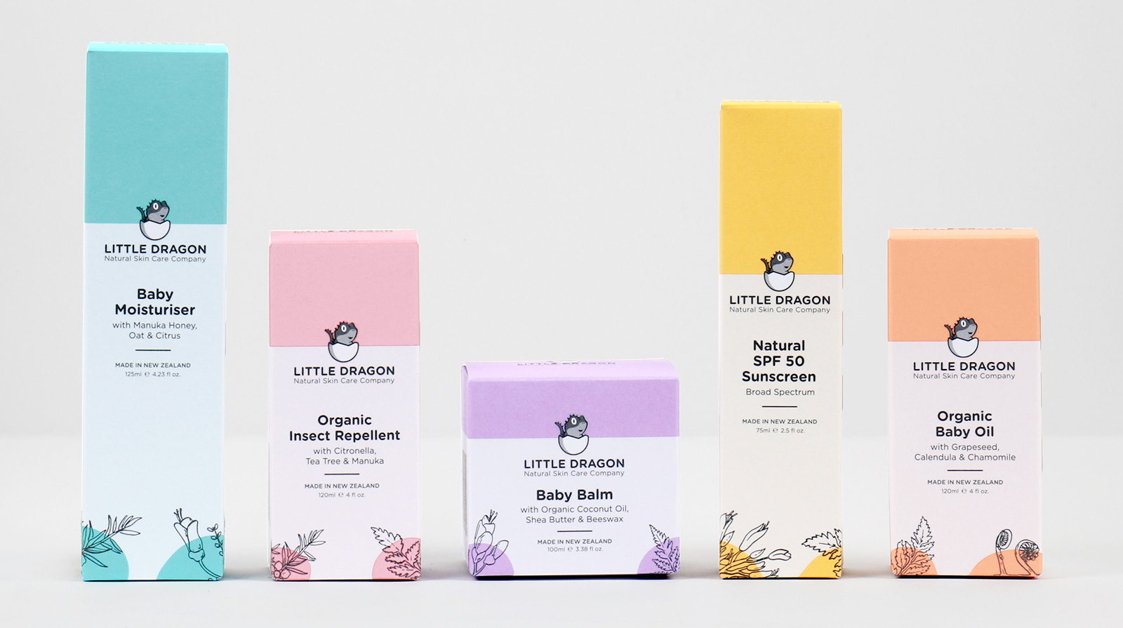
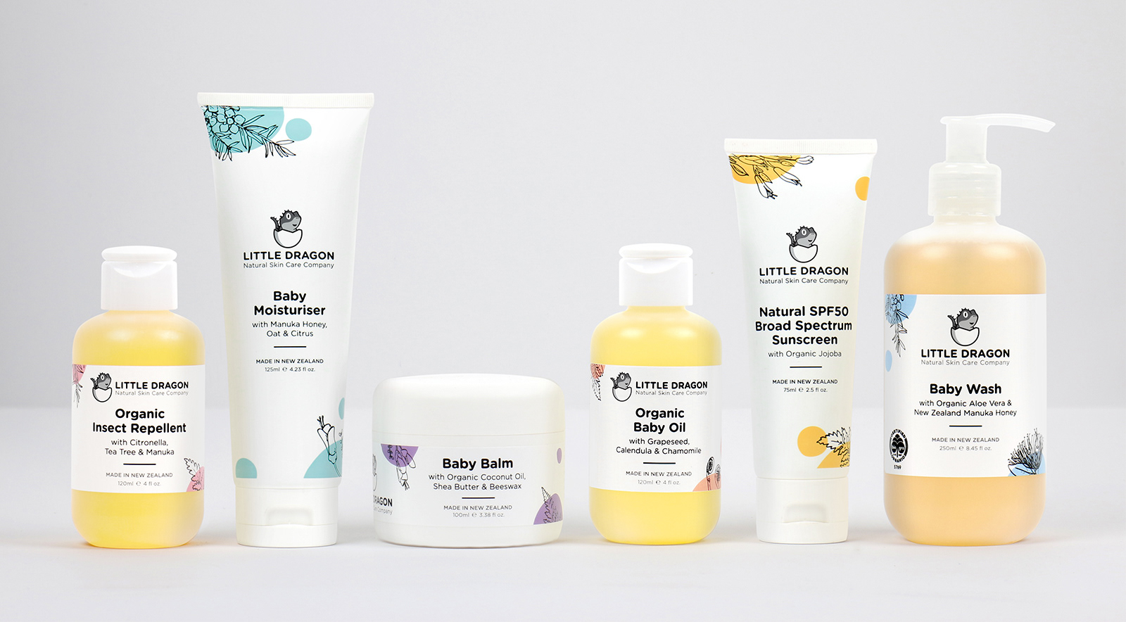
Little Dragon is a start-up that aims to provide parents with an alternative to chemical-laden skin care products for babies. Proudly run by a young New Zealand family, the company launched in late 2017 with a range of six products made of natural, organic and eco-friendly ingredients.
––––––––
M Y C O N T R I B U T I O N
Full creative direction and design of visual identity, packaging and supporting communications.
A G E N C Y
Personal Freelance.
––––––––
The company name is a playful take on New Zealand's own living "dragon" – the Tuatara lizard. The logo aims to represent the Tuatara as a cute, stylised illustration, with the placement in an egg further reinforcing the fact it's a baby.
A simple, rounded san-serif font is chosen to complement the illustration style, and is used throughout the identity as it has clean, easy to read forms and a soft, welcoming, natural feel.
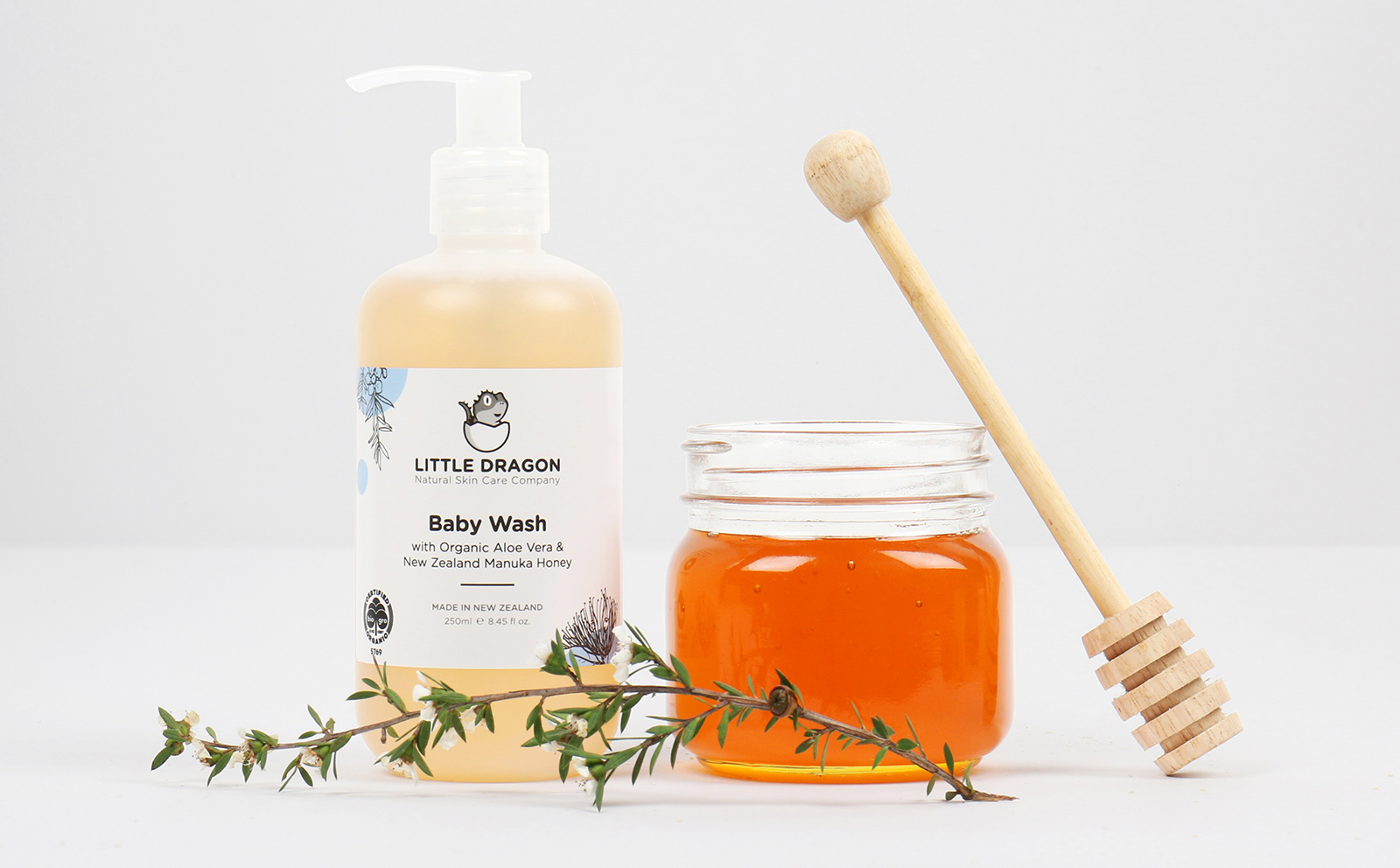
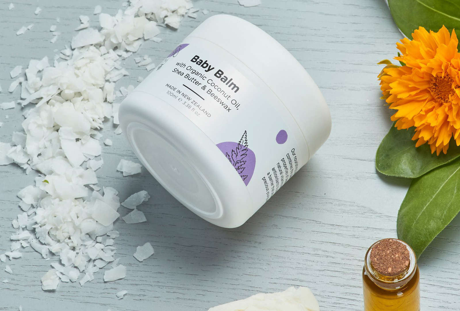
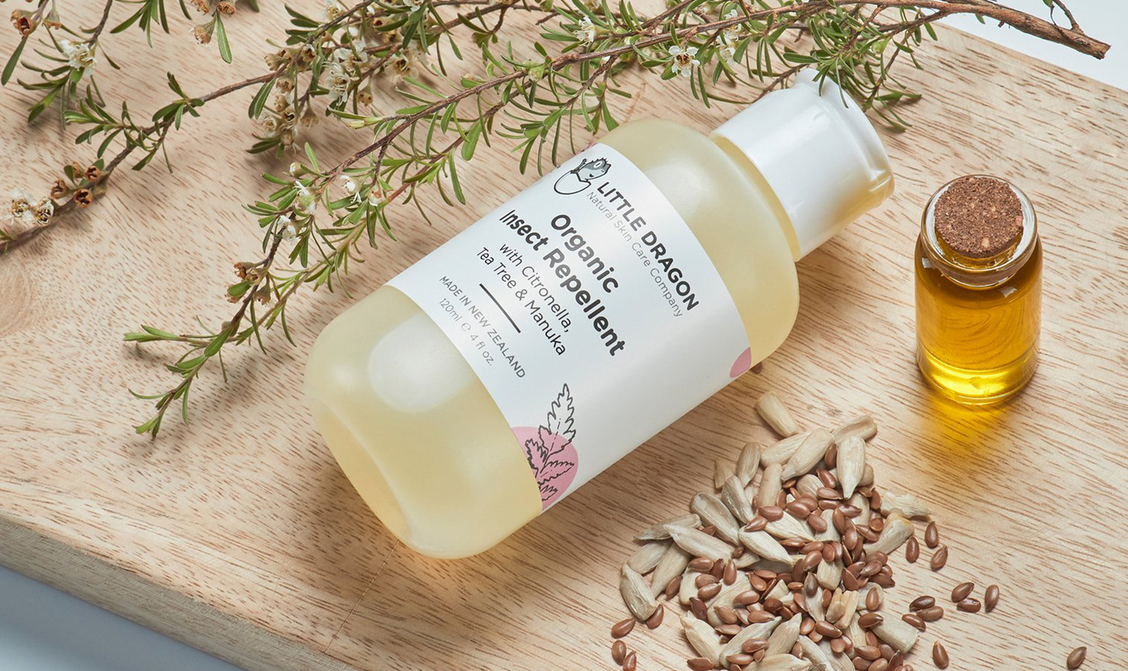
The brief asked to highlight Little Dragon’s New Zealand roots in a natural way. My solution was to literally draw on nature – utilising illustrations of well-known New Zealand flora to create a texture that can be applied to packaging and communications.
The illustration style is kept purposely simple to represent their values like natural, organic and trustworthiness. It’s also an attempt to find some middle-ground between the classic kid-focused “cute” style packaging common in the market, and something that would appeal to the parents actually buying the products.A range of colours are used to help differentiate each product and give the identity further personality, with each toned down to slightly softer tints to reflect that the products are for babies. The rest of the packaging keeps things simple – plenty of white space allowing the colour to shine and present information clearly, and reinforcing an idea of safety, cleanliness and trustworthiness.
Overall, a simple, clean and contemporary look, that still has a sense of fun and strong New Zealand feel.