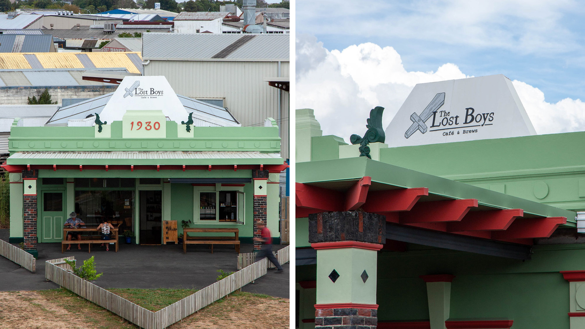
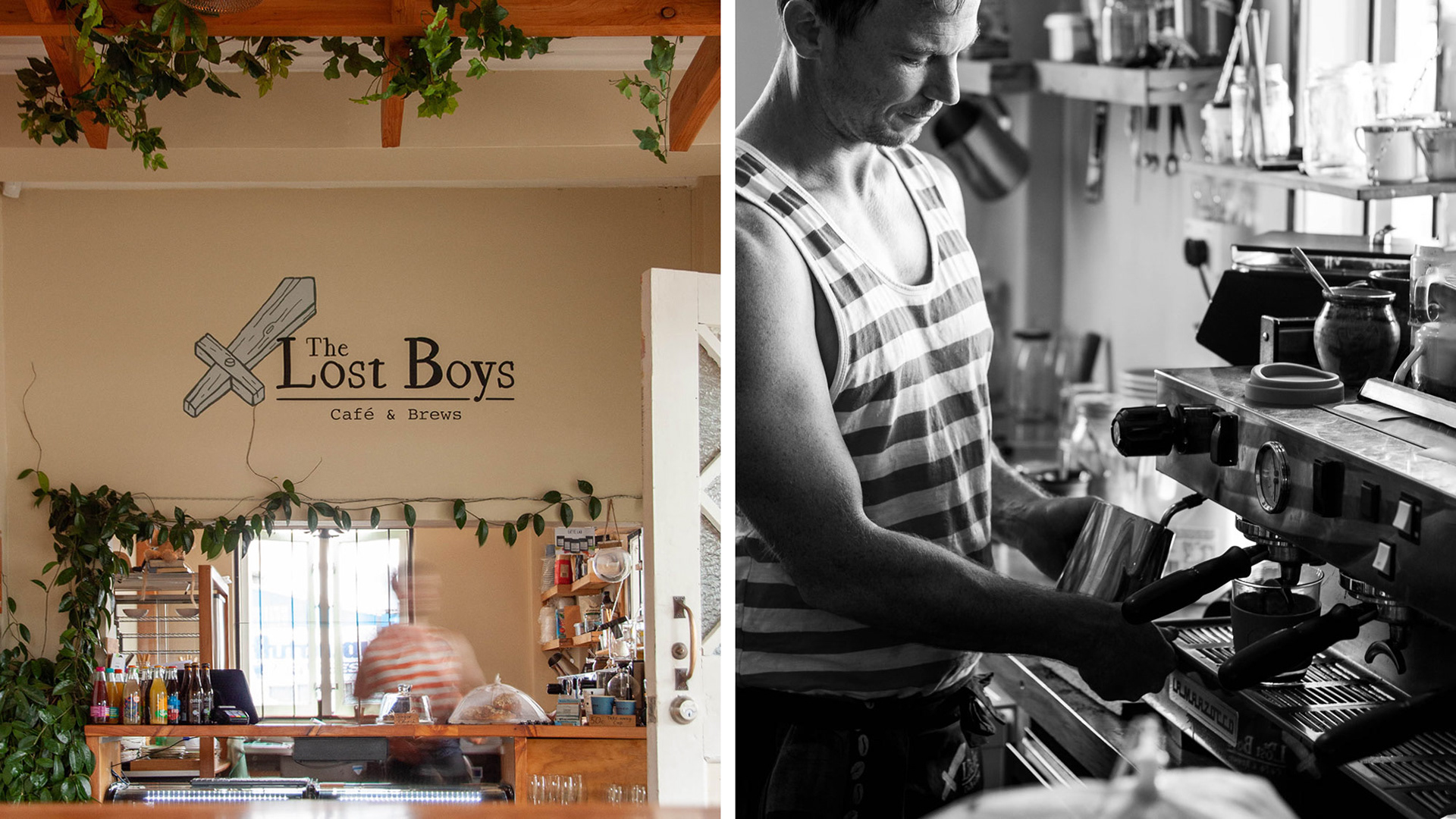
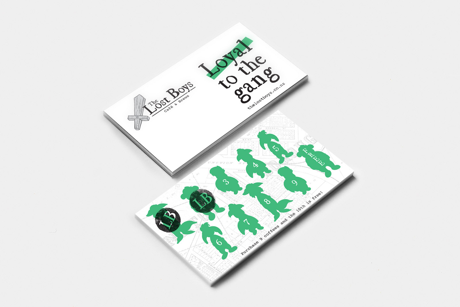
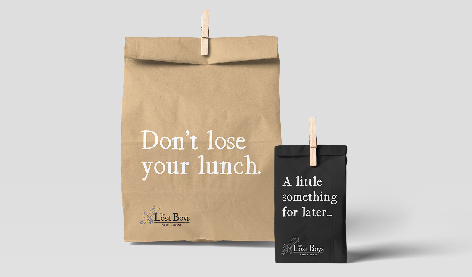
The Lost Boys is a café that opened in Hamilton in early 2018. The owner James needed a logo and visual identity that could be applied to a wide range of media. The name is inspired by the classic Peter Pan tale, with The Lost Boys being a group of rag-tag lads who never grow up. James wanted the café and branding to celebrate these themes of having fun, being a big kid at heart, and not taking life too seriously.
––––––––
M Y C O N T R I B U T I O N
Full creative direction and design of visual identity and all supporting media.
A G E N C Y
Personal Freelance.
––––––––
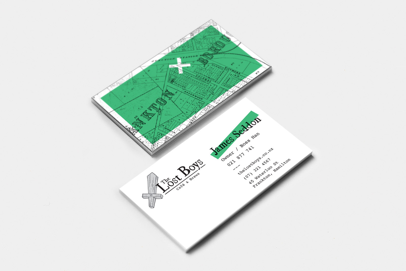
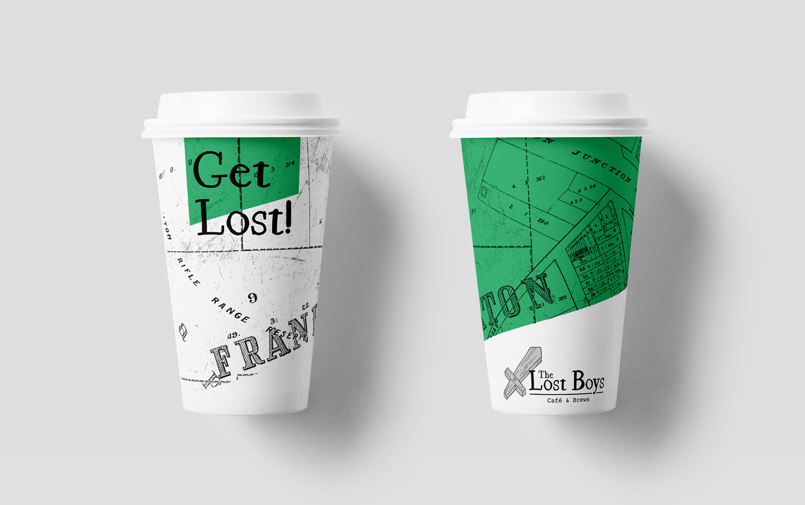
The logo has a very relaxed, hand-drawn style to represent that whimsical nature. The wooden toy sword represents the key themes of The Lost Boys, and is paired with a handwritten typeface to give the logo a playful, youthful feel. It has strong visual links to classic adventure storybooks from that era. Courier is also used to further reinforce the writing inspiration, and adds a nice contrast through out the identity.
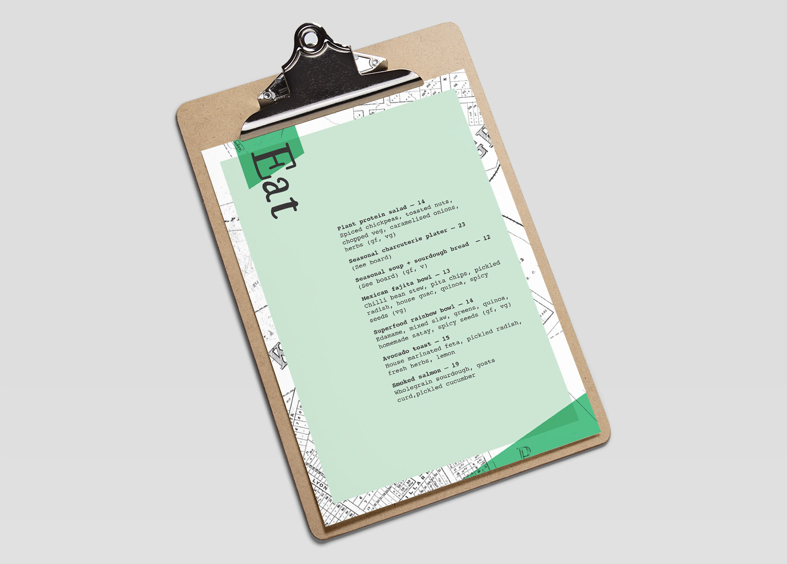
The colour system is kept purposefully simple so as to work with the interior design style of the café. A rich green is used to complement the hanging gardens and wide use of timber. Old maps of Hamilton City and the Frankton area are used to show respect to the heritage of the old gas station that the café is situated in. Maps also serve to reinforce a Lost/Found theme. Angles are applied to the graphic elements to add a sense of fun and quirkiness to the designs.
The overall look fits well with a modern yet quirky café, while still maintaining a strong sense of fun and playfulness.